UI/UX

Mobile App UI Design Trends and Tips - 2020

-
Written By:
Hardeep Singh
-
Posted on
04 Mar 2020
The market for mobile apps is huge, furthermore, it is growing rapidly. The mobile app market is expected to generate revenue of more than $300 billion by 2022, proving the depth and size of this market.
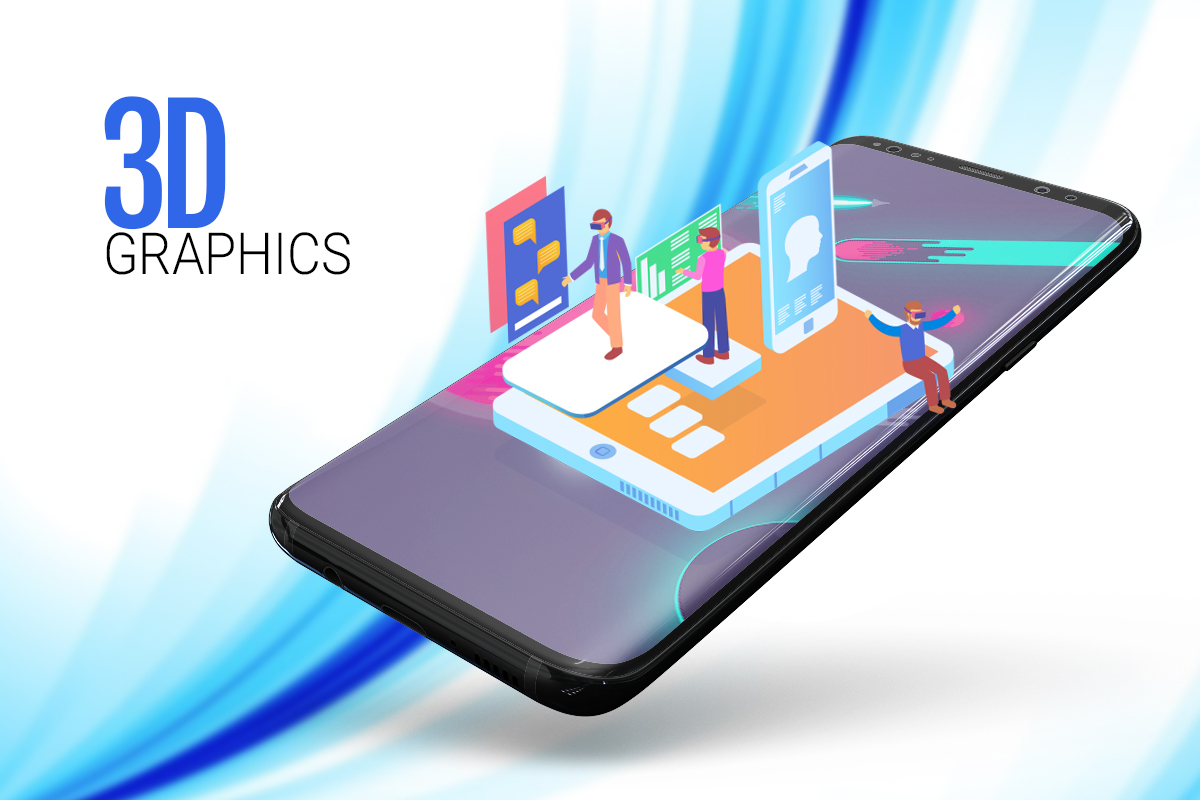
1. 3D Graphics
Mobile app and game designer must learn to program for mobility. 3D graphics integrated into mobile app UI. 3D images are much closer to real-world objects than flat graphics... both gamify the app and lend the futuristic vibe that users love in any popular app. The 3D rendered images as an inspiration in the mobile apps UI design are not limited to eCommerce websites or landing web pages for that matter but can be applied to screen interactions, Website page, on boarding screen or anywhere the designer consider fit in an app.
2. Content clarity
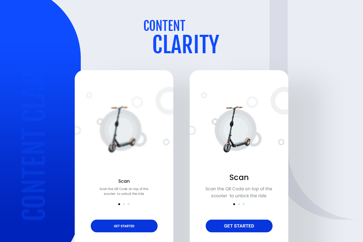
Designing for the Mobile app has to be based on making the content as clear possible for Mobile app visitors and readers or they will simply leave your app. This makes the content unreadable and loses credibility. Alongside, increasing the font size of changes the alignment and Letter Spacing between words and paragraphs. Each element on the mobile app screen must be understandable and Effective. Keep interface elements to a minimum. A simple design will keep the user at ease with the product.
3. Better Navigation
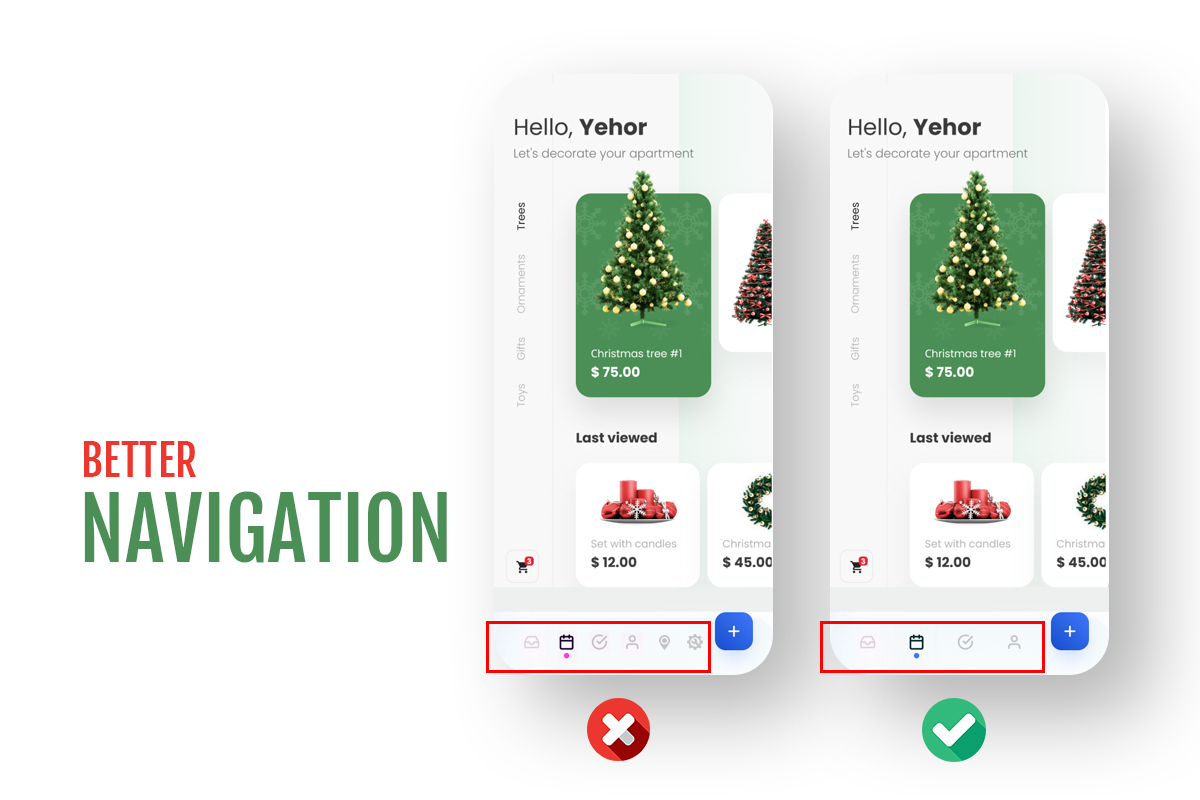
Better Mobile navigation makes it easy for people to find what they need. To keep users stuck to your app, navigation must be sleek. Navigation allows swiping your app easily and enhancing the user experience.
4. Typography
(a) Alignment
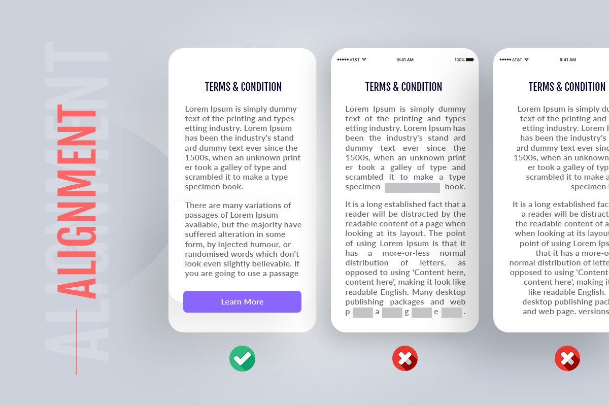
Normally, text can be placed 4 ways: left, right, center or justified. Which one is better in mobile app typography. Depending on the type of a mobile app, designers apply appropriate alignment for text blocks. Left-Aligned text is the most common setting for left to right languages such as English. Center alignment works best when dealing with just a few short lines of text. Right-aligned text is the most common setting for right-left languages.
(b) Line Height
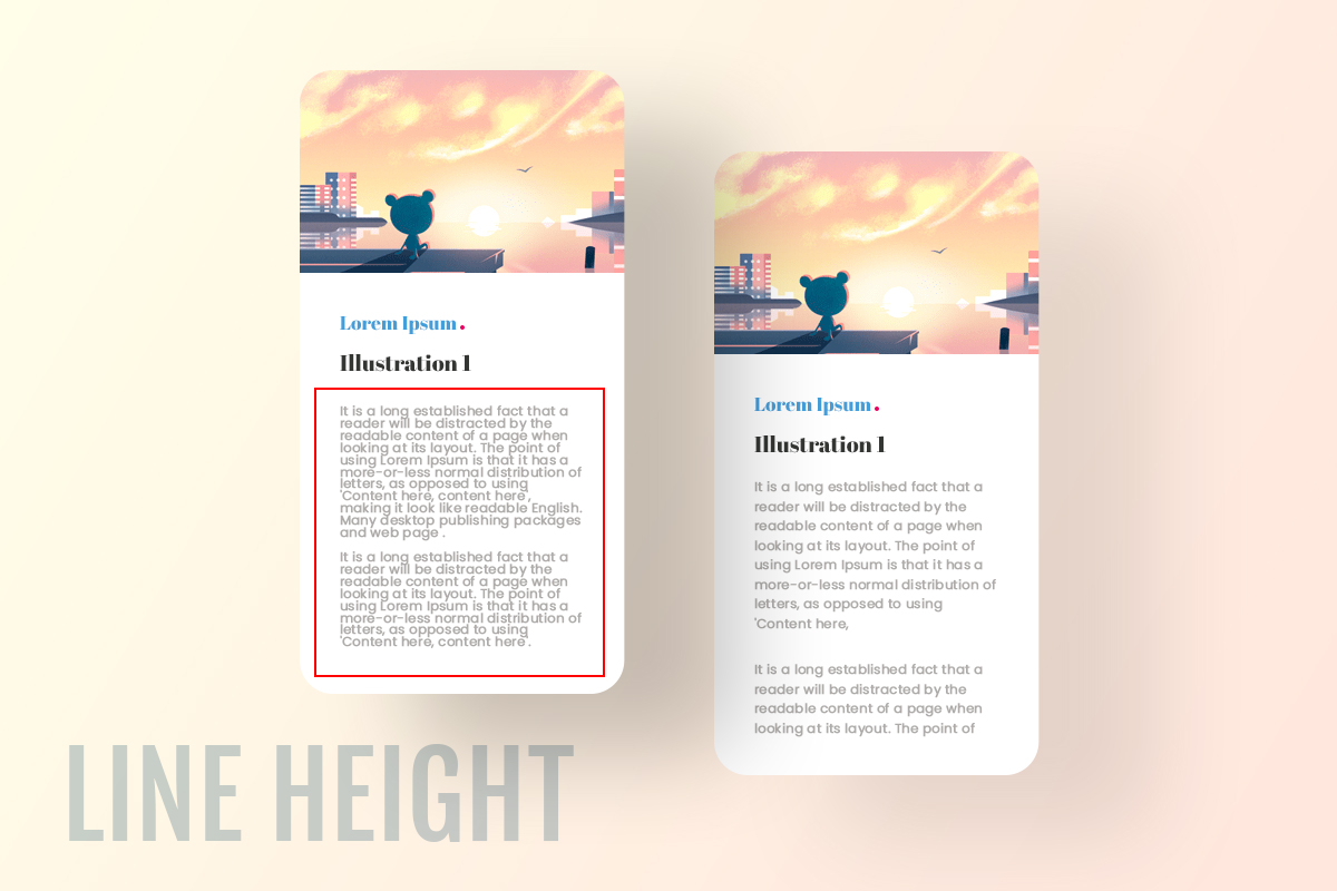
Mobile app designers have started to embrace a reasonable measure for text. The same method is used while generating Line Height too, start by categorizing your project in 1 of these 3 web/app archetypes and then multiplying the font size with the recommended scale.
(c) Font Size
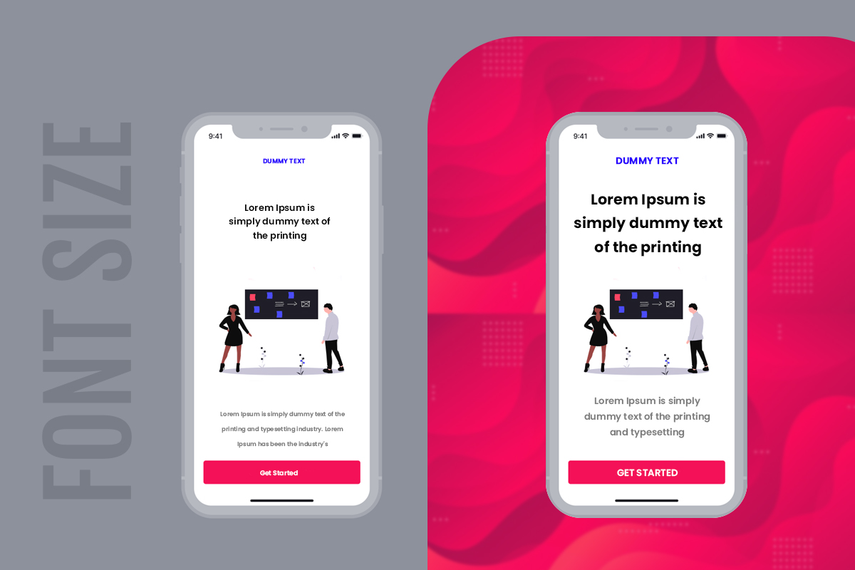
As you know, you have got a small space, so the font size matters a lot. If you use tiny font on a mobile screen, Such tiny text may be impossible to read. Although users can pinch to see the text, in which case users will delete your app. it’s not an excuse. Smaller text may hurt user’s eye and takes more time to read, while bigger text may use up the screen quickly and break in the reading coherence. current size of the iPhone and Android screens, you should be able to use at least an 11-point font.
(d) Letter Spacing
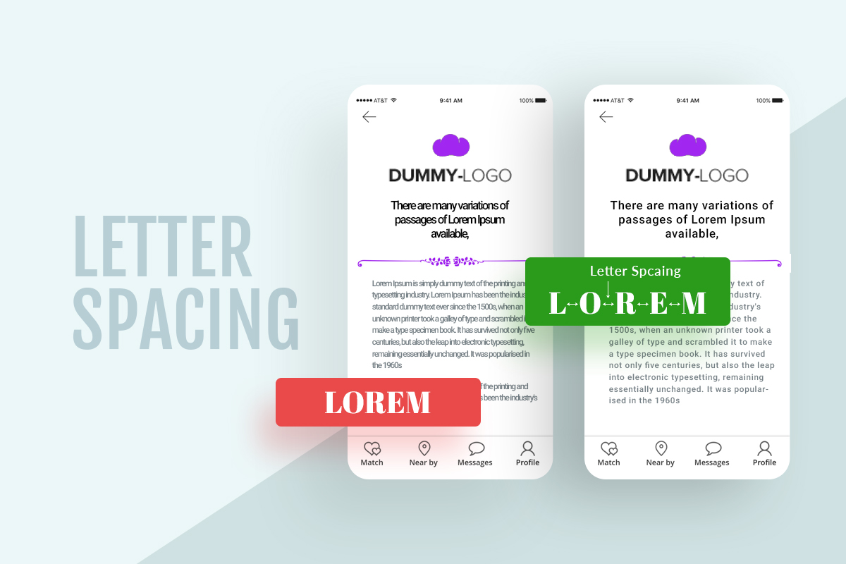
Letter spacing is very important in typography. If you want to make your all caps headings easier to read, increase the letter spacing. Increasing the letter spacing gives the edges of each word a teeth shape instead of a straight line.
5. Color Combination and Contrast
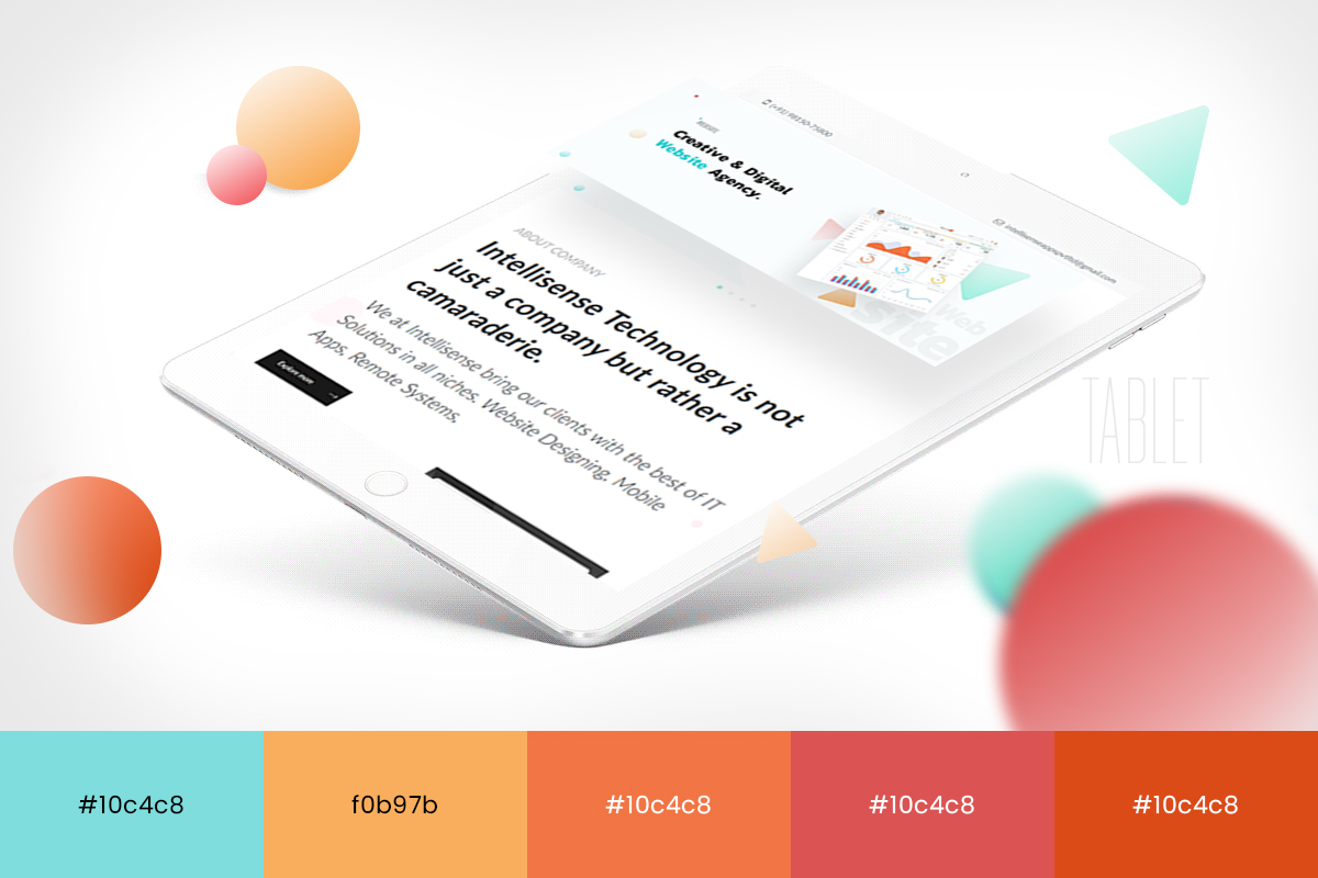
Every user has a different taste and choice when it comes to using an application. Color is an important element in Mobile app design. There's a lot the right color palette for designs. The trend of bright UI color schemes with high contrast colors is relatively newer and was introduced earlier this decade. for example photo editing mobile apps, games and Music players etc. have certain buttons and options that need to be visible. High-contrast gradients can also be used for mobile app design of applications that have important content.
Recent Posts
- Plot No. B1/823/1A, Aman Nagar, Tanda Road, Nr. KMV College, Jalandhar.
- +91-9815075800
- harjitsingh575
- info@intellisensetechnology.ca
Copyright © 2026 Intellisense Technology All Rights Reserved
Chat with Us

